How To Wear The Runways’ Boldest Shades
It’s time to put away the greige and neutrals – this season is all about super-saturated, unapologetically bright hues. By CHLOE STREET
From jewel-toned to electric and pastel to acid, color is firmly back on the menu for fall/winter 2025. Last year, designers mostly dabbled in either pastels – think butter yellow and icy blue – or deep, dark shades like brown and burgundy. This season, however, they have turned their attention to super-saturated, unapologetically bold hues. “Wearing a bright shade boosts my confidence and makes me feel like I stand out – we all need that sometimes,” says art director Federica Labanca, for whom Haider Ackermann’s debut for Tom Ford was a highlight of the fall/winter shows – “a great example of a subtle yet powerful use of color.”
Saint Laurent creative director Anthony Vaccarello also served his most colorful collection to date – a power-shouldered wardrobe of jackets and pencil skirts in coral, fuchsia, violet and jade, while Sarah Burton’s otherwise monochrome Givenchy debut homed in on a punchy highlighter yellow, which might just become this winter’s Brat green.
For anyone accustomed to neutrals, bold color can be intimidating to adopt. But it can also imbue a sense of power that camel or navy simply never could. “Color shapes the way you hold yourself,” says London-based stylist Laura Vidrequin Roso. “Neutrals let you retreat, while color pushes you forward. In a slower economy, when so much feels reduced or contracted, putting on color is expansive.”
Head to toe
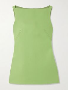
For an outfit with impact, consider a full look in a single bold color. The fall/winter runways were awash with inspiration: from the top-to-toe tomato seen at Ferragamo, Magda Butrym and Acne Studios, to the enveloping emerald at Tom Ford or the all-over sunset hues at Zimmermann, single-shade dressing is a low-lift, maximum-impact way to demonstrate fashion flair. Whether you pair a bold maxi dress with accessories in a matching hue, or a suede skirt with a cotton T-shirt in the same tone, the trick is to ensure the specific shades are as closely matched as possible to keep the look polished. And, says Labanca, pick a shade that suits your skin tone, hair color and features. “I think color only makes sense when it complements you, otherwise the clothes wear you.”
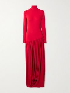 MAGDA BUTRYMPleated stretch-crepe midi dress£398.00View Product DetailsSelect a Size34 - out of stock36 - out of stock38 - out of stock40 - out of stock
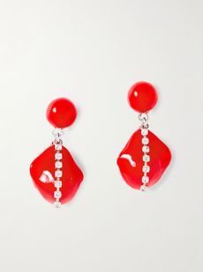 COMPLETEDWORKSRhodium-plated resin and crystal earrings
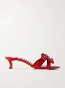 MANOLO BLAHNIKCafredda 50 bow-embellished leather sandals£278.00View Product DetailsSelect a Size36 - out of stock36.5 - out of stock37 - out of stock37.5 - out of stock38 - out of stock38.5 - out of stock39 - out of stock39.5 - out of stock40 - out of stock40.5 - out of stock41 - out of stock41.5 - out of stock42 - out of stock43 - out of stock
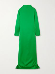 TOM FORDOversized open-back satin-crepe gown£1,996.00View Product DetailsSelect a Size36 - out of stock38 - out of stock40 - out of stock42 - out of stock44 - out of stock46 - out of stock


Texture play
When compiling a color-saturated look, embrace different textures to add sophistication and ensure an outfit feels interesting and layered. An acid-green silk shirt might feel jarring paired with a brown skirt in the same fabric, for example – but revisit the latter in a brown suede, and the outfit formula softens. “Use suede, silk and wool to create dimension,” suggests Vidrequin Roso. Unsure where to start? Try leather and cashmere – contrast the weight of Nour Hammour’s plum-toned leather ‘Drey’ jacket with Khaite’s super-soft ‘Nera’ cashmere crewneck in light blue, and finish with Loewe’s greige wool straight-leg pants: the perfect balance of complementary tones and textures.
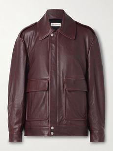 NOUR HAMMOURDrey leather jacket£532.00View Product DetailsSelect a Sizex small - out of stocksmall - out of stockmediumlarge - out of stock
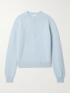 KHAITENera cashmere sweater£762.00View Product DetailsSelect a Sizex small - out of stocksmall - out of stockmedium - out of stocklarge - out of stockx large - out of stock
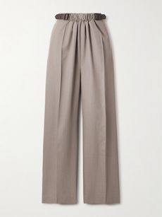 LOEWELeather-trimmed pleated wool-twill straight-leg pants£550.00View Product DetailsSelect a Size32 - out of stock34 - out of stock36 - out of stock38 - out of stock40 - out of stock42 - out of stock44 - out of stock
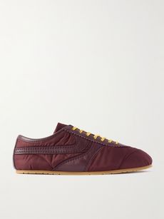 DRIES VAN NOTENLeather-trimmed shell sneakers£277.00View Product DetailsSelect a Size35 - out of stock3637 - low stock38 - out of stock39 - out of stock4041 - out of stock


Cocktail hour
After-dark invitations provide the perfect opportunity to embrace the rainbow more freely than you might in your everyday wardrobe, where functionality and versatility tend to be front of mind. Rather than reaching for your favorite LBD for your next cocktail event, opt instead for a short, structured mini in a zingy hue – like Emilia Wickstead’s ‘Rifer’ wool-crepe mini dress. Switch out black accessories for those in the same color family: Gucci’s ‘Selen’ horsebit mules in dark green and Toteme’s ‘Bevel’ satin tote in pastel yellow will keep the look nuanced. Instead of diamonds or pearls, opt for the warmth of deep brown resin jewelry – Dinosaur Designs’ rounded resin ring delivers a fresh take on cocktail bling.
 EMILIA WICKSTEADRifer wool-crepe mini dress£299.00View Product DetailsSelect a Size4 - out of stock6 - out of stock8 - out of stock1012 - out of stock14 - out of stock16 - out of stock
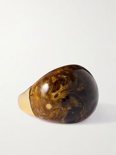 DINOSAUR DESIGNSLarge gold-tone resin ring
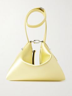 TOTEMEBevel satin tote
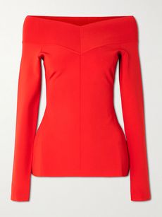 STELLA MCCARTNEYBardot off-the-shoulder paneled jersey top£248.00View Product DetailsSelect a Sizexx small - low stockx small - out of stocksmall - low stockmediumlargex large - out of stock


Color clash
Where once there were rules about mixing black and brown or pink and red, the fall/winter runways advocated for clashing, unexpected colors to create flashes of drama. Gucci demonstrated the deliciousness of soft pink paired with tomato red, and lilac with lime, while Tory Burch deftly combined apple green and khaki. Pairing a soft pastel – such as La Ligne’s ‘Liam’ pink cashmere tank – with a rich autumnal hue like the burgundy red of Joseph’s ‘Forrest’ pants is always a safe bet.
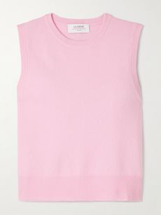 LA LIGNELiam cashmere tank£105.00View Product DetailsSelect a Sizexx small - out of stockx small - out of stocksmall - out of stockmedium - out of stocklarge - out of stockx large - low stock
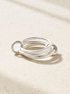 SPINELLI KILCOLLINSolarium set of three sterling silver rings
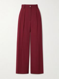 JOSEPHForest pleated wool-blend crepe wide-leg pants£149.00View Product DetailsSelect a Size32 - out of stock34 - low stock36 - out of stock38 - out of stock40 - out of stock4244 - out of stock
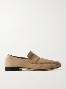 THE ROWSoft suede loafers£1,250.00View Product DetailsSelect a Size36 - out of stock36.5 - out of stock37 - out of stock37.5 - out of stock3838.5 - out of stock39 - low stock39.5 - low stock4041 - out of stock


Power suiting
In recent seasons, tailoring has largely leaned on an ’80s banker aesthetic, with charcoal grays, power shoulders and pinstripes as mainstays. This season, however, designers championed an altogether more flamboyant energy, with suiting in an array of super-saturated hues: from electric blue at Dries Van Noten to violet at Gucci and sunshine yellow at Saint Laurent. A well-cut suit in a punchy color can be a throw-on-and-go power piece, but if you feel hesitant to embrace in-your-face officewear, Vidrequin Roso recommends starting with a single piece: “If you don’t want to commit fully, pair a forest-green blazer (such as Max Mara’s ‘Talento’ wool belted style) with black pants, which is far less daunting.” It’s best to keep the accessories sleek and discreet: a slim belt, a neutral bag and pared-back shoes. “The color is already the protagonist,” concludes Vidrequin Roso, “so the supporting cast should be subtle.”
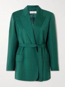 MAX MARATalento belted wool-canvas blazer£299.00View Product DetailsSelect a Size6 - out of stock8 - out of stock10 - out of stock12 - out of stock14 - out of stock16 - out of stock18 - out of stock
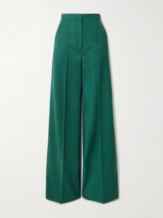 MAX MARAFernet embroidered wool-canvas wide-leg pants£184.00View Product DetailsSelect a Size4 - out of stock6 - out of stock8 - out of stock10 - out of stock12 - out of stock14 - out of stock16 - out of stock18 - out of stock
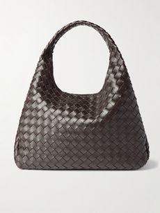 BOTTEGA VENETACampana large intrecciato leather shoulder bag
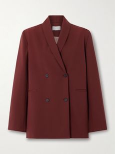 LOULOU DE SAISONSancia wool-blend blazer£166.00View Product DetailsSelect a Size34 - out of stock36 - out of stock38 - out of stock40 - out of stock42


RELATED READING
The people featured in this story are not associated with NET-A-PORTER and do not endorse it or the products shown