Why A Colorful Watch Face Is 2022’s Biggest Jewelry Trend
Classic white dials are fading into the fashion background this year, as the finest watchmaking maisons celebrate color in all its glory. By CHARLIE BOYD
If you’re considering buying a new timepiece, the hunt normally begins with a few basic questions: what is your budget, which brand do you admire most and which metal tone should you choose? After those initial parameters are set, the thought process tends to shift straight to straps – whether you’re looking for leather or metal, and how those options will marry with your existing lifestyle and wardrobe. For those who tend to wear a fully stacked wrist, exploring how a new addition will sit with your existing collection of bracelets and rings is often another consideration. This year, however, there is a fourth factor at the fore: which color to choose from this season’s array of boldly hued dials.
“Year on year, we’re used to seeing one color emerge as the leading trend. In 2020, it was blue; in 2021, it was green. So, for 2022, we were expecting to see one prevailing color inspire watchmaking maisons again,” says Maxim De Turckheim, jewelry and watches senior buyer at NET-A-PORTER and MR PORTER. “In an unexpected twist, though, we’ve seen myriad colors emerge across the board,” he explains. “From rich, bold dials in burgundy and claret, through to jeweled tones of opulent green and vivid blue, timepieces have been brought to life with color and it seems that a far-from-dull dial is the prevailing trend of 2022 – you just need to choose the shade that best speaks to your personal style.”
Perhaps it was in response to the pandemic that maisons collectively landed on a plethora of hues without one consistent theme. Within the world of fine jewelry, rainbow-toned jewels have similarly soared in popularity as we seek to find joyous, optimistic expression within our jewelry wardrobe. Dopamine dressing has prevailed within ready-to-wear collections, too. Now, more than ever, it seems an individualistic, bold timepiece might just capture the zeitgeist.
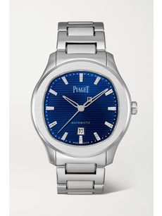 PIAGETPolo Automatic 36mm stainless steel and diamond watch

“One way to indulge in the trend is to select a classic model that has been updated with a matching dial and strap in a striking color – this is the most eye-catching interpretation of the trend””Maxim De Turckheim, jewelry and watches senior buyer at NET-A-PORTER and MR PORTER
So, how to choose from this year’s vibrant novelties? “One way to indulge in the trend is to select a classic model that has been updated with a matching dial and strap in a striking color – this is the most eye-catching interpretation of the trend,” says De Turckheim. Jaeger-LeCoultre’s iconic ‘Reverso’ timepiece, originally conceived as a sports watch with a revolving case to protect it during polo matches, has been dressed in sumptuous green, complete with a perfectly color-matched leather strap and a dusting of diamonds that enhance its audacious hue. Similarly, Hermès Timepieces’ ‘Nantucket Dual Time’ features a navy alligator strap that complements the rich blue of its split dial – a contemporary combo of lacquered blue and sparkling aventurine to reflect two time zones. These monochrome designs are ideal for those who lean towards one particular gemstone in their jeweled wrist stack – after all, a wrist bedecked in emeralds or sapphires would be the perfect home for either style. Alternatively, simply slip them into a low-key, layered look with multiple strands of day diamonds.
At this time of year, as we lean towards warmer, darker hues in our wardrobes, a burgundy dial is another striking choice – it retains the classicism of black, but with a little more oomph. Look to IWC Schaffhausen’s ‘Portugieser Automatic Chronograph’, which delivers a big, bold dial in spades. Boasting a 41mm face, it makes for an unapologetic option, but the steel case and black leather strap balance out its daring shot of color, making it easy to style with denim for downtime, as well as a crisp white shirt and oversized tailoring for workwear this fall. If you’re set on a steel case but seeking a more subtle dial, choose Cartier’s ‘Panthère de Cartier’ with a graphite-gray face – while perhaps not the most exuberant of colors, it still offers a punchy contrast to a traditional white style.
Of course, if you just want to dip your toe into bold timepieces, there’s a blue to suit. “Vivid blue tends to be a good place to start if you’re not used to wearing strong color,” says De Turckheim. “We’re generally all accustomed to wearing it in some way, whether that’s classic blue denim or navy tailoring, so it’s not too much of a mental shift to select a watch with a punchy blue dial, which also tends to suit all skin tones.” The Piaget ‘Polo’ is an ’80s icon that looks especially striking when given a daring dial. In sunray-brushed blue, there is an almost electric quality to its cushion-shaped face, while diamond hour markers and a steel bracelet strap lend an extra-precious feel to its gender-neutral design codes. If dial detailing is your thing, then Vacheron Constantin’s ‘Patrimony’ is a sophisticated option. Its ombré effect requires meticulous gradient powdering and lacquering in order to achieve a uniform blend of blush pink – craftsmanship that’s testament to the maison’s 267 years of fine watchmaking.
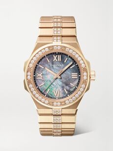 CHOPARDAlpine Eagle Automatic 36mm small 18-karat rose gold, diamond and mother-of-pearl watch

RELATED READING