9 Ways To Bring Brighter, Bolder Colors Into Your Home
Whether you are a master of maximalism looking to dial up the vibrancy, or a minimalist who’d like to experiment with something a little brighter, there is a whole spectrum of ways to incorporate bolder shades into your space. Here, three interior designers and color connoisseurs share their tips for making a bold palette work for you. By KATIE BERRINGTON
Set a happy, harmonious scene
“I think color brings great joy and vibrancy to any interior; it is instrumental to use it to create moods and set the scene for a beautiful space,” says Charlotte Rey, co-founder of design atelier Campbell-Rey, which brings vivid flair to its global residential and commercial projects. “I prefer a well-balanced palette – a space should sing like a harmony – and colors, or anything else for that matter, shouldn’t fight. A room should feel warm, welcoming, comfortable and at ease.”
Start small
For those wanting to dip their toe into experimenting with shades bolder than their comfort zone, “start with the smaller things – like cushions and throws,” says Rey. This can also apply to the type and size of space that these colors are introduced into. “People are often wary of using bold colors in small spaces – I feel the opposite!” says London-based designer Rachel Chudley, known for her distinctive use of color and pattern. Rey agrees: “I like a small and surprisingly bright guest bathroom.”
Offset a lack of natural light
“I often lean into vibrant palettes in small spaces without much natural light, as it takes them away from being drab and makes them cozy and interesting,” says Chudley. “Think of the areas you want to bring a little ‘extra’ to – these may be the spaces where you introduce bold color.”
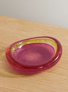 FOURTH STREETGlass bowl
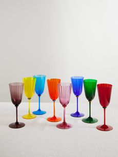 LA DOUBLEJSet of eight Murano wine glasses


“My work epitomizes a daring amalgamation of hues, materials and textures”Laura Gonzalez
Play with how colors interplay
“I gravitate towards a distinctly bold palette. Examining my furniture collection, one will notice my penchant for juxtaposing colors that may initially appear to be starkly contrasting,” says architect and interior designer Laura Gonzalez, who weaves her maximalist magic across residential, commercial and hospitality projects. “My work epitomizes a daring amalgamation of hues, materials and textures. As an example, for Hotel Byblos, in Saint-Tropez, the signature color is orange – and so I incorporated it into one of the new suites I have designed there. This particular color brings a sense of joy to a space.”
Embrace the unexpected
“I particularly love purple as it always somehow feels unexpected,” Chudley continues of her favorite hue to work with. “It adds fun and can set a particular mood – either nodding to the 1970s, referencing the rich robes of the renaissance, or bringing a really cutting-edge, contemporary feeling to a space.”
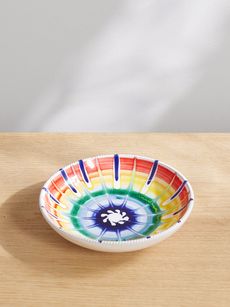 AQUAZZURA CASARic Rac set of two printed porcelain soup plates
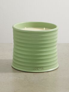 LOEWE PERFUMESCucumber medium scented candle, 610g
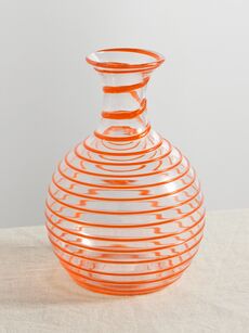 YALI GLASSA Filo striped glass carafe
 REFLECTIONS COPENHAGENSoho crystal bookend


“Colors really set the impression of a space, so one should consider nuances and hues very carefully”Charlotte Rey
Think about the nuances
It is how you pair colors together that is particularly exciting, agrees Rey. “For example, I love an Eau de Nil shiny velvet with a deep burgundy-red gloss paint or metal. Or a coral-pink moiré with a very dark chocolate,” she says. “Colors really set the impression of a space, so one should consider nuances and hues very carefully; a green can be very sour – and feel fresh like a splash of lime in a cocktail, but it can also feel hideous! One has to consider the light that it sits in, too. Daylight changes during the day and color will change with it.”
Create an eye-catching focal point
“Bold colors draw attention and therefore can be used to create a focal point in a room. This helps when highlighting areas or features such as an accent wall, a piece of furniture or an artwork. They also allow us to add personality and character, making the space more unique,” says Gonzalez. “You can see this in the mini bars that were added to the suites at Hotel Byblos. The bold blue contrasting with the white helps to bring it to the center of attention of the room.”
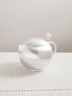 NATALIA CRIADOTeiera silver-plated and rose quartz teapot
 MARLO LAZStella Mare Giardino glass dish
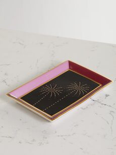 SUZANNE KALANPorcelain jewelry tray
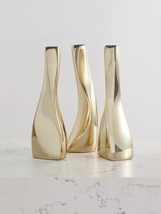 FOURTH STREETSet of three gold-tone candlesticks


Liven up a living space
“If I were to choose a single room [to prioritize bringing bold hues into], it would undoubtedly be the living room,” shares Gonzalez. “This space exudes a sense of welcome, and serves as the perfect canvas for sharing and expressing emotions, more profoundly than any other area. The vibrant colors should be thoughtfully selected to mirror and enhance the room’s purpose.”
Consider the impact of hues on your mood
“Finally, colors have a psychological impact on our emotions,” concludes Gonzalez, and therefore hues should be chosen that put you in a better mood. “Personally, I feel more comfortable in a space full of bold colors; they make me feel alive.”
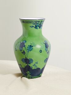 GINORI 1735Ming large porcelain vase
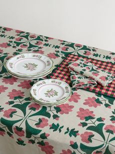 CABANANine piece dining set
 LA DOUBLEJMama striped Murano glass carafe
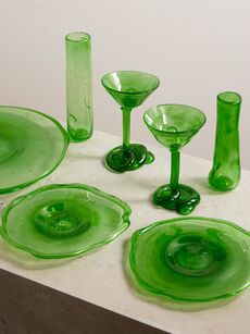 COMPLETEDWORKSSeven-piece serving set


RELATED READING